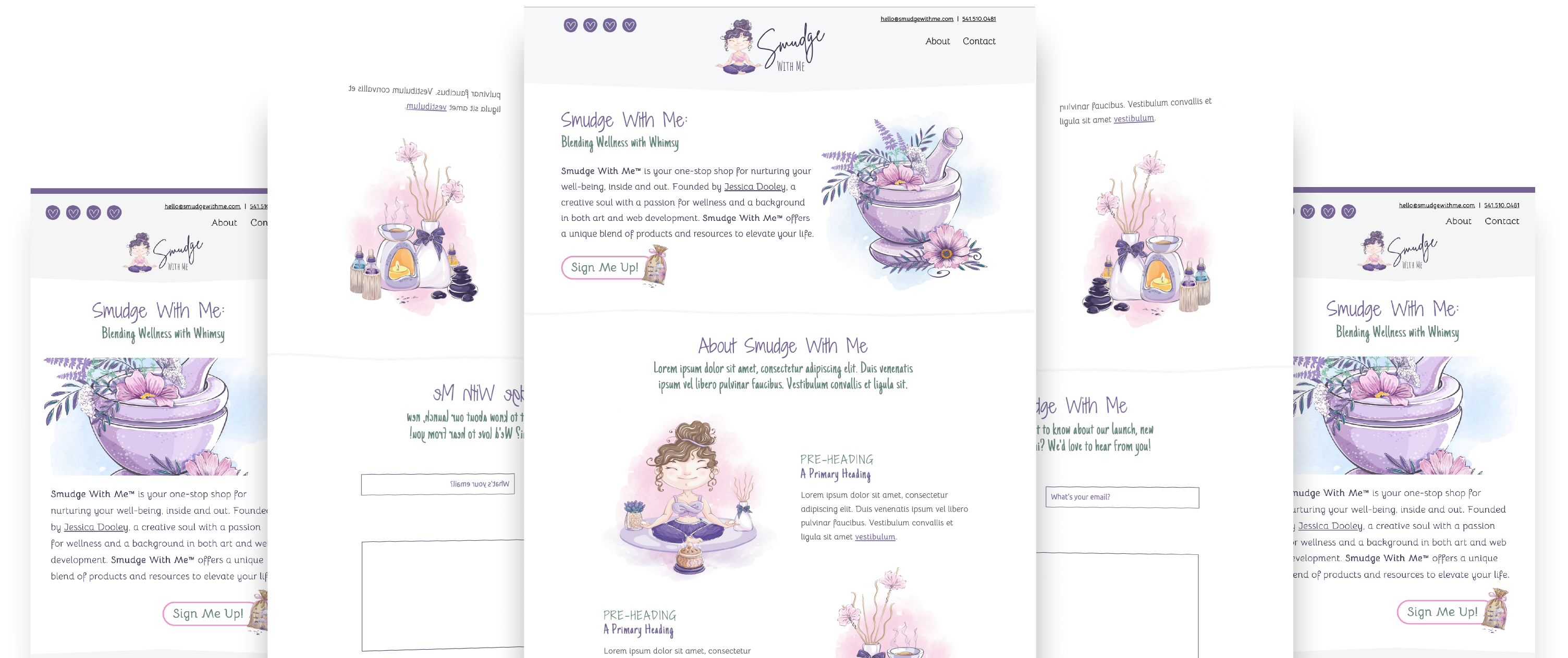
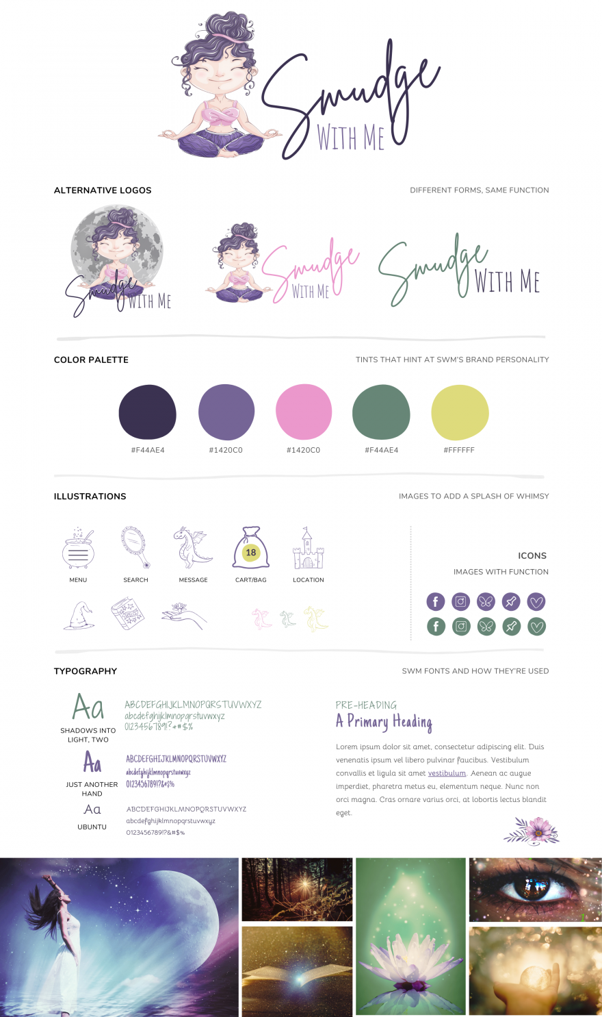
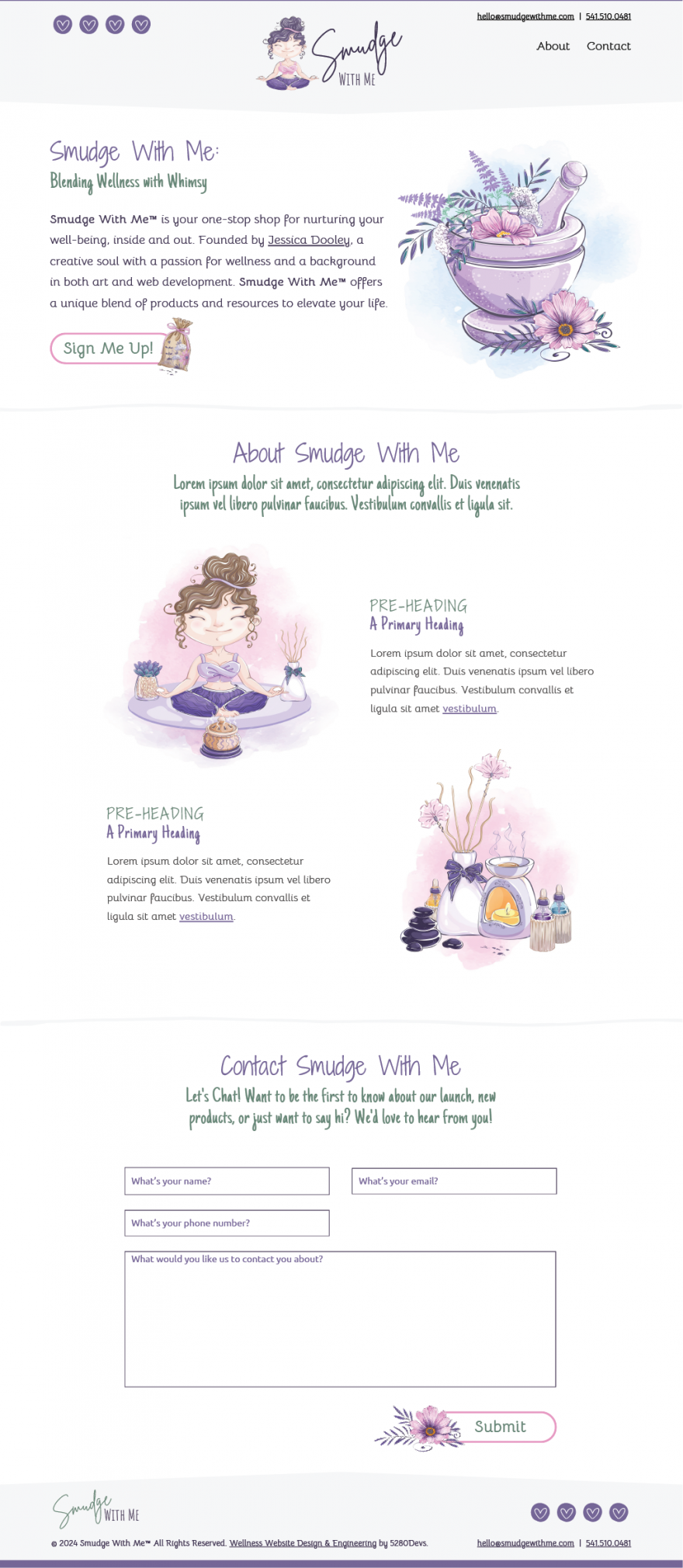
First, we needed to establish the brand. What message we want to convey, and how that will look. We know we wanted something playful and fun, while also warm and welcoming. We wanted something that would appeal to clients, customers, practitioners, and other holistic businesses. So we started playing with imagery and came up with an adorable and playful character for the artwork. Next we explored fonts and pairings, we knew we wanted something that felt more "personal" so we ended up with a hand-written style font. Next we moved on to colors and the palette. We knew we wanted to stay away from anything too traditional, with the primary colors being purples, for that "magic" feel, and a splash of greens and yellows for that "earthy" feel. We offered 3 options in total, and after a couple of tweaks we we're able to convey the message perfectly.
- Purples: Magic, Creativity, Energy
- Pink: Nurture, Compassion
- Yellow: Happiness, Joy
- Green: Nature, Health, Balance